This document is meant to provide you with some guidance on acceptable font size and general type legibility, especially when using multiple typefaces in a single piece. The guidance here focuses mainly on print materials, though the general principles are applicable across all media.
Interpreting the Code
The relevant sections of the PAAB Code are:
2.1 All [APS] must be accurate, complete and clear and designed to promote credibility and trust. Statements or illustrations must not mislead.
2.4 […] The advertising copy should provide sufficient information to permit assessment of risk/benefit in a prominent manner.
3.5.1 The body copy must contain reference to negative findings in a prominent manner.
Recognizing the space challenges associated with print APS, these Code provisions are meant to achieve 3 main goals in this context:
PAAB has used the general standard that indication disclosure and fair balance information is at least 75% of the size of other body copy in the piece.
Confusion may arise when PAAB asks for an increase in font size even though your computer software may suggest that all copy meet the above requirements. For example, PAAB may still be concerned about legibility and comment on font size even though your body copy is set at 12pt and your Fair Balance is set at 9pt. The situation most typically arises in pieces that use multiple typefaces. To better appreciate this, the following diagram depicts the different elements in font sizing.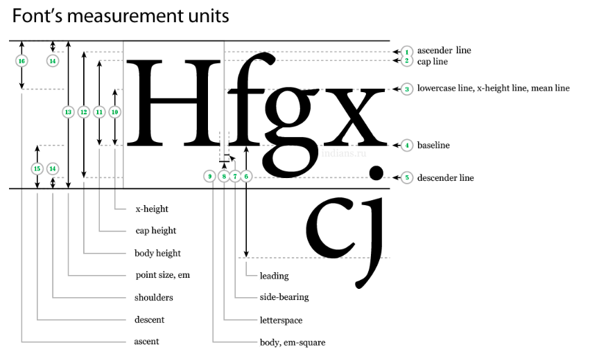
In the first diagram, notice how point size (13) includes the spacing above (16) and below (15) the x- height (10). The font designer will determine the degree of this spacing, and so a 12pt font from one typeface may have a different x-height than the 12pt font from another one. Therefore, the x-height and cap height (11) are key considerations for PAAB review, as these more accurately reflect the amount of space the characters occupy inside the em-square (9).
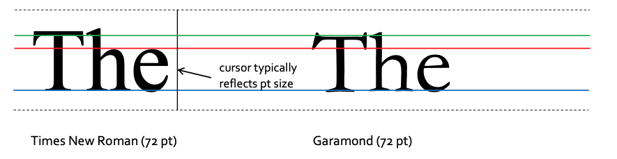
The example illustrating the differences between Times New Roman and Garamond has not been bolded or manipulated in any way. Measuring from the blue line, the red line represents TNR’s x-height and the green line represents Garamond’s cap height. For the x-height, notice how the height of the “e” and the shoulder of the “h” are smaller in Garamond than in TNR. For the cap height, the stem of the “T” is shorter in Garamond (note: the serifs do not count towards the cap height). The result is that Garamond characters appear smaller in the final printed piece.
Finally, even though these differences are most problematic when using two different typefaces, it is possible for difficulties to arise in the same typeface. For example, the x-height for 48pt size may not necessarily be 4x the x-height at 12pt size in the same typeface. Whether this is true or not depends on the individual font used.
Other typeface-specific factors can factor into the “perceived size” and overall legibility of the body copy. Beyond x-height and cap height, PAAB may consider:
Height of ascenders (1) and descenders (5)
Font weight, even when no bold or italics are applied (notice how Garamond is a thinner font
than TNR)
Letterspace/kerning (8) and line spacing/leading (6) may also effect legibility if letters or lines are spaced too closely together. Not only do individual fonts have separate letter and line spacing as determined by the font designer, but software allows you to manipulate these elements as well. Thisisanexampleofcopythatisdifficulttoreadduetoinappropriateletterspacing.Letter spacing is usually problematic for italicized fonts and “condensed” or “thin” typefaces at smaller sizes.
Applying the Code
The wealth of fonts used by clients to creatively express or communicate a brand or product message means it can be difficult to define precise parameters around what constitutes clear, legible, and appropriately visible copy. The following guidance accounts for many of the infringements seen at PAAB.
If you are using the same typeface with no other manipulations to the font’s weight, letter- or line-spacing, then a straightforward 75% mathematical rule is generally acceptable for comparing body copy and fair balance copy (e.g., using 20pt size for body copy and minimum 15pt size for fair balance).
In assessing font size between different typefaces, PAAB will initially compare samples of the font to the x-height and the cap height of the body copy. If concerns regarding legibility or prominence remain, changes to other paramaters (e.g., font weight, letter or line spacing, contrast, etc.) may be required. Excessive reduction of letter spacing and line spacing, especially where the result leads to characters touching each other, will likely be returned for revision.
Remember that the overarching goal is to ensure that readers are provided with balanced and accessible health information to lead to better healthcare decision-making. Applying these principles can mean shorter reviews and a more expedited process for everyone.
![]()
 View in Full Forum
In an effort to constantly serve our clients better, PAAB has unveiled a new electronic submission process(eFiles). Effective January 2, 2008 all submissions will have to be submitted via the eFiles system. Please have a Senior Official (Director level) send an email to the administration team at review@paab.ca with the contact information of the person(s) who will be designated as administrator(s) for your company. Click on eFiles, on the menu, then eFiles Tutorial for a tutorial on how eFiles works.
Please contact the admin team at PAAB if you need assistance with eFiles
 Community Forum Guide